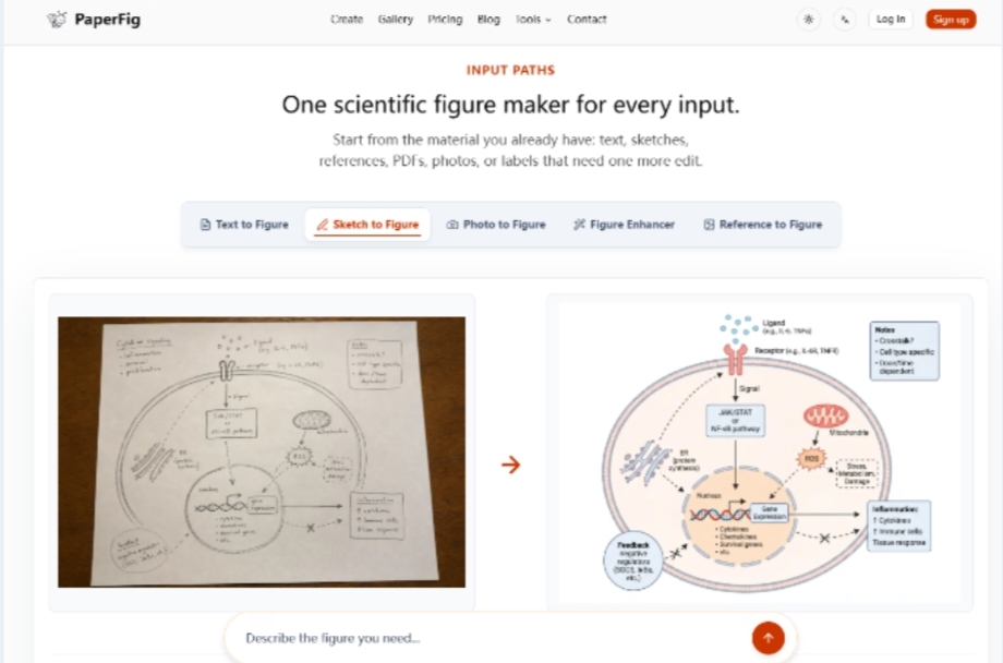
A seminar can fail even when every panel looks neat. Students follow the arrows on the screen, the speaker tells a different causal story, and the room spends ten minutes arguing about a label that was never the learning point. That is the practical test around PaperFig: not whether a slide can be decorated quickly, but whether one reviewed visual message can survive both a classroom explanation and a later manuscript cut.
Researchers who start from a plain-language mechanism, a rough sketch, or another early artifact usually need an editable draft instead of a blank canvas. For teaching desks, the useful claim is narrower. If the same figure must appear in a seminar deck and in a thesis chapter, the labels have to stay under human control after the first draft appears. Decorative polish is secondary to a shared reading order.
Seminar Figures Fail When Reading Order Drifts
Teaching figures are judged in real time. A pathway that looks balanced at poster size can still confuse a room if the eye enters on the wrong object. Students treat left-to-right order, arrowheads, and bold labels as the argument. If those cues disagree with the spoken explanation, the figure becomes a second lecturer with its own syllabus.
This is why “make it prettier” is a weak brief for seminar work. The brief needs one claim the audience must leave with, the sequence of entities that support that claim, and the words that will be spoken aloud when each panel appears. Without that, generation only accelerates disagreement and burns rehearsal time on nomenclature fights.
One Visual Message Must Survive Slide And Paper Cuts
Course teams often keep two files for the same idea: a bright slide version and a denser paper version. The hidden cost is drift. A teaching assistant shortens a label for readability; a coauthor later restores a technical name; by defense week the two versions no longer describe the same relationship. The wasted hours rarely show up as “figure generation.” They show up as another evening spent reconciling vocabulary.
A better rule is one scientific message, two display densities. The classroom cut may hide secondary detail, but it should not invent a different mechanism. The paper cut may add compartments and conditions, but it should not reverse an arrow that students were taught as activation.
Keep Classroom Labels Identical To Manuscript Labels
Lock the entity names before either export. If the slide says “macrophage signal” and the thesis figure says “CCL2-driven recruitment,” the audience has already been trained on the wrong handle. PaperFig’s OCR label editing matters here because a single wrong word can be patched without regenerating the whole composition and quietly moving every other object.
For seminar prep, treat label text like glossary entries. If a term is not ready for the glossary, it is not ready for the figure. That habit prevents the common defense-week failure where the speaker spends the first minute apologizing for nomenclature instead of explaining the result.
Choose Text Or Sketch From What Students Already See
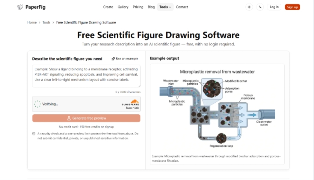
Input choice should follow the teaching artifact you already have, not the newest button on the page. Text works when the mechanism can be spoken as ordered relationships. A notebook sketch or whiteboard photo works when panel order and grouping are already visible in class notes. A reference image can suggest hierarchy, but it is not permission to copy a published figure.
PaperFig also states a useful boundary for education workflows: it is strongest at mechanism diagrams, workflows, and graphical-abstract style schematics. It is not a plotting package for raw statistical charts. If the seminar needs a bar chart from primary data, keep that work in the analysis stack and use the figure maker for the explanatory system around it.
Treat The Draft As A Teaching Object Not Clip Art
After generation, ask whether a student who missed the lecture could still recover the claim from the figure alone. If the answer depends on a joke in the speaker notes, the draft is incomplete. If the answer depends on a color that disappears in grayscale printouts, the draft is fragile for handouts.
This check is stricter than “does it look scientific.” It asks whether the visual can carry the lesson when the audio fails. Teaching teams that run this check before they debate fonts usually cut a revision cycle and keep office hours focused on the science rather than the artwork.
OCR Fixes Protect Dual Versions Of The Same Figure
AI labels can be wrong. For seminar use, that is not a minor cosmetic issue. A misspelled gene name on a slide becomes a memorized error. Regenerating the whole figure to fix one word can also change arrow geometry and force another round of coauthor review, which is exactly the cost a teaching desk cannot afford during a crowded presentation week.
The practical loop is generate once from a constrained brief, then correct labels in place. When a team uses an AI scientific figure maker for dual outputs, approve the scientific reading order first, patch wording second, and only then decide whether the classroom needs a simpler crop of the same reviewed panel.
A hard fail for teaching use is easy to name: if fixing one label moves an approved arrow onto a different compartment, discard the export even if the slide still looks polished at full-screen size.
Export PNG First Then Upgrade Only Approved Panels
Basic PNG is enough for rehearsal and lab-meeting discussion. Faithful 4K PNG, and editable SVG or PPTX after label fixes, become useful when the same panel is moving into a thesis PDF or a shared slide master. Spending those upgrades before the spoken story is stable usually wastes export effort on a draft that will be rewritten.
A simple acceptance table keeps the teaching desk honest:
|
Check |
Pass signal |
Fail signal |
|
Spoken claim |
One sentence matches the main arrow path |
Speaker needs a second story to explain the figure |
|
Label glossary |
Slide and thesis use the same entity names |
Synonyms appear without a defined mapping |
|
Student test |
A late arrival can restate the mechanism from the image |
Questions focus on “what does this arrow mean?” |
|
Export stage |
PNG for rehearsal; higher exports only after label lock |
4K or SVG requested while names still move |
If any row fails, skip another style prompt and return to the claim sentence and the entity list. That return is cheaper than rebuilding the slide after a practice talk collapses into vocabulary repair.
Keep Teaching Materials Grounded In Reviewed Science
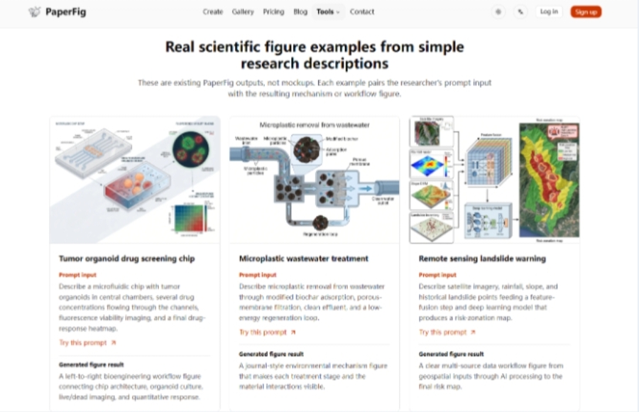
PaperFig does not claim ownership of figures you create, and teaching use is an intended path alongside papers and slides. That still leaves institutional and journal policy with the user. For seminar packs and thesis defenses, the safer habit is to review every relationship as if a hostile examiner will ask which panel is hypothesis and which panel is measured evidence.
Use the tool when the bottleneck is turning a clear teaching story into a readable first draft. Skip it when the underlying claim is still unsettled, or when the only available source material cannot be shared with an AI-assisted workflow. In those cases, no export format will repair the lesson.
The figure that helps a defense is usually the one that makes disagreement visible early: wrong label, wrong arrow, wrong reading order. If a draft does that cheaply, it has already earned its place in the teaching stack.