Struggling to turn your assignment or research data into something visually appealing? You’re not alone.
Many students find it hard to create charts that are both professional and easy to read. Traditional tools like Excel or PowerPoint can be overwhelming, especially if you’re short on time.
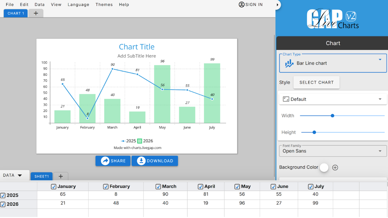
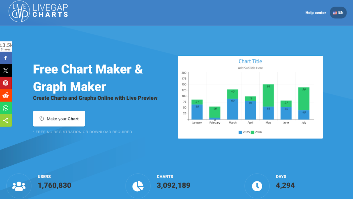
Fortunately, Livegap Charts makes it simple. This free, browser-based tool lets you design beautiful charts and graphs in minutes, with no downloads, installations, or signups required. Whether it’s a class project, research paper, or presentation, you can make your data stand out and easy to understand.
Even better, students can learn the concepts behind charts as they work, experimenting with data and instantly seeing how changes affect the graph. They can also hide or show rows and columns to explore different patterns, making it easier to understand trends and comparisons.
Why Students Should Use Livegap Charts
- Free and Browser-Based – No installation or registration needed.
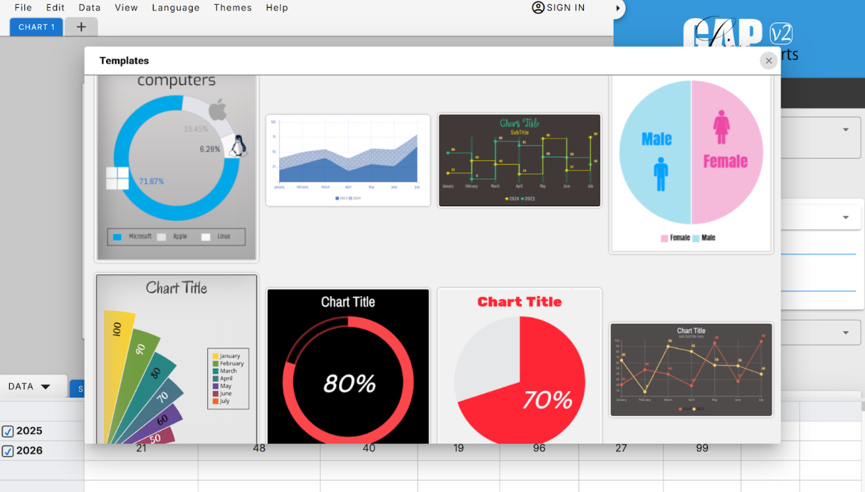
- Multiple Chart Types – Line, Bar, Pie, Doughnut, Radar, and more.
- Easy Customization – Adjust colors, labels, fonts, and legends.
- Learn Chart Concepts – Interactive editing helps students understand data visualization principles.
- Show/Hide Rows and Columns – Explore different perspectives of the data for better understanding.
- Perfect for Academic Work – Ideal for assignments, projects, and presentations.
Getting Started with Livegap Charts
To begin, simply open Livegap Charts in your browser. The clean and user-friendly interface allows you to start creating charts instantly without any setup or registration.
Choose Your Chart Type
Select the chart that best represents your data:
- Bar Chart: Compare categories or values.
- Pie Chart: Show percentages or proportions.
- Line Chart: Display trends over time.
- Radar/Doughnut Charts: For more advanced visualizations.
💡 Tip: Pick the chart that makes your data easiest to interpret.
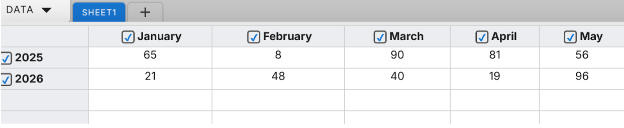
Input Your Data
Enter your data into the table provided:
- Add labels (e.g., Months, Subjects, Categories)
- Add values (numbers corresponding to each label)
- Copy and paste data from Excel or Google Sheets if needed.
- Hide or show rows and columns to explore your data from different angles and learn how each set of numbers impacts the chart.
Customize Your Chart
Enhance your chart’s visual appeal:
- Change colors for each series.
- Adjust fonts for titles and labels.
- Show or hide legends.
- Add a chart title.
💡 Tip: Use consistent colors and readable fonts to make your charts clear.
Download or Share
After finishing your chart:
- Download it as PNG or SVG for your assignments or presentations.
- Share a direct link online if needed.
Tips for Students
- Use bar charts for comparing subjects or categories.
- Use pie charts for percentages or proportions.
- Add icons for more visual engagement (optional feature).
- Experiment with showing and hiding rows or columns to better understand data relationships.
- Learn chart concepts by seeing changes in real-time as you edit your data.
Conclusion
With Livegap Charts, students can transform raw academic data into professional, easy-to-read charts while also learning the concepts of data visualization. The interactive features like hiding/showing rows and columns help students explore data in depth and understand patterns more clearly.
It’s free, online, and perfect for any assignment, project, or research paper.
Start visualizing and learning today!
🔗 Start creating charts now: charts.livegap.com